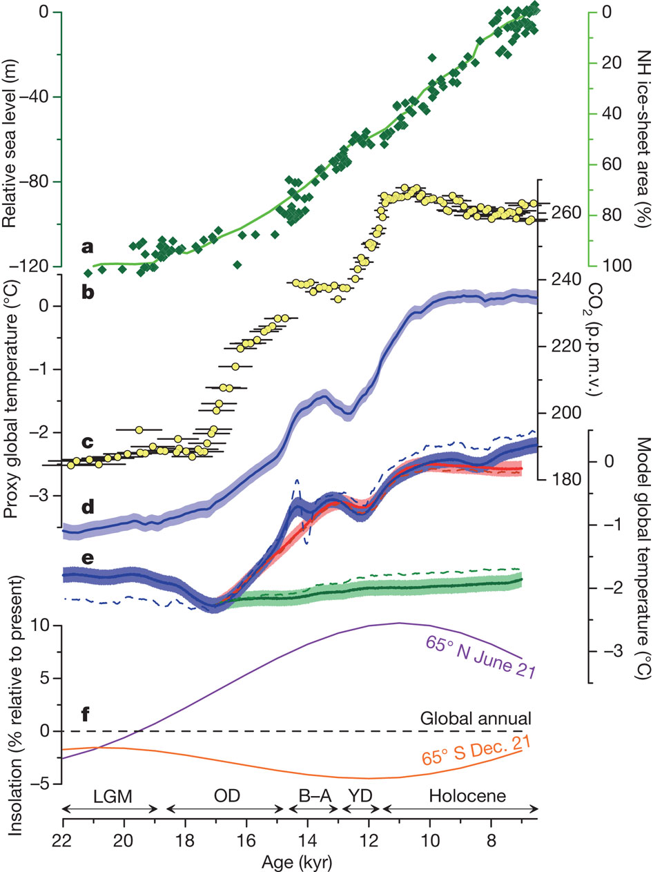
The xkcd "Earth Temperature Timeline" depicts the global average temperature during the past 20,000 years, based on the known data. We already have a question about the chart's general accuracy, but I have a more specific question.
The chart says that multi-decade, multi-degree global climate shifts should be easily visible, and the fact that the chart is smooth and shows no such variances until it suddenly jumps in the past hundred years gives the graphic its visceral power.
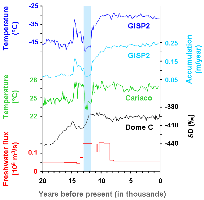
But then, I found out about a myriad of known abrupt climate change events, such as the Younger Dryas 12,000 years ago, during which the temperature of large parts of the northern hemisphere decreased in temperature by 2 to 6 degrees Celsius over mere decades, then stayed that way for a millennium. Yet no rapid shifts like this are visible in the xkcd chart. This seems to imply that either
- the temperature shift in much of the northern hemisphere during the Younger Dryas was exactly counterbalanced by concurrent temperature shifts in the rest of the world so that the global average looks virtually the same; or
- the xkcd chart omits important details; or
- there are major contradictions in climate data from various sources.
Are one of these options correct, or is something else going on?

