Thanks @daniel.neuman, I have looked up some profiles to get some data:
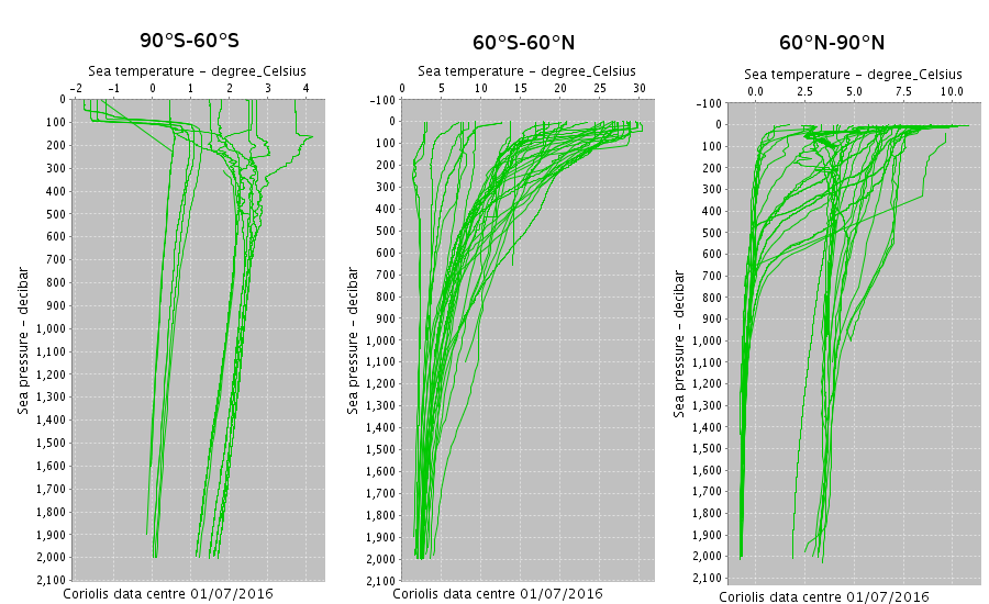
Here we see Sea temperature data as measured by the Argo project buoys on the x-axis as function of the pressure in decibars on the y-axis.
Note that decibars correspond to metres as one delves into water.
I took the data for a period of 1st until 10th of June 2016 (this is one full cycle of the Argo buoys), longitudinally over the whole globe, latitudinally between 60°N and 90°N.
Thus this data includes streams from the arctic (as seen in the colder curves) and the mid-latitudes (the warmer curves). I have checked the other latitudes, between 60°S and 60°N, they essentially look similar to the warm curves seen in here.
Between 90°S and 60°S they look similar, but suprisingly a bit warmer than on the northern hemisphere.
