4
$\begingroup$

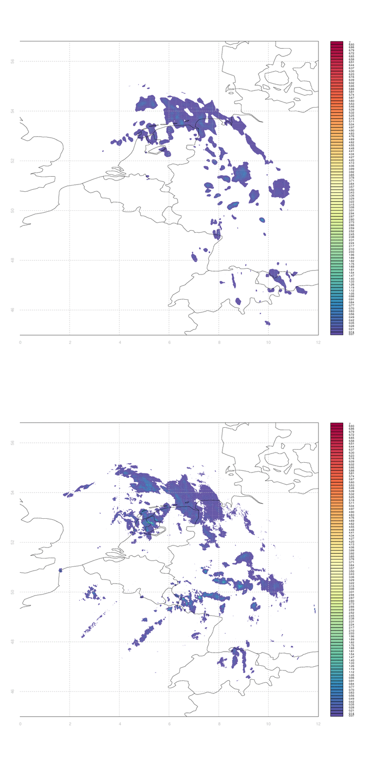
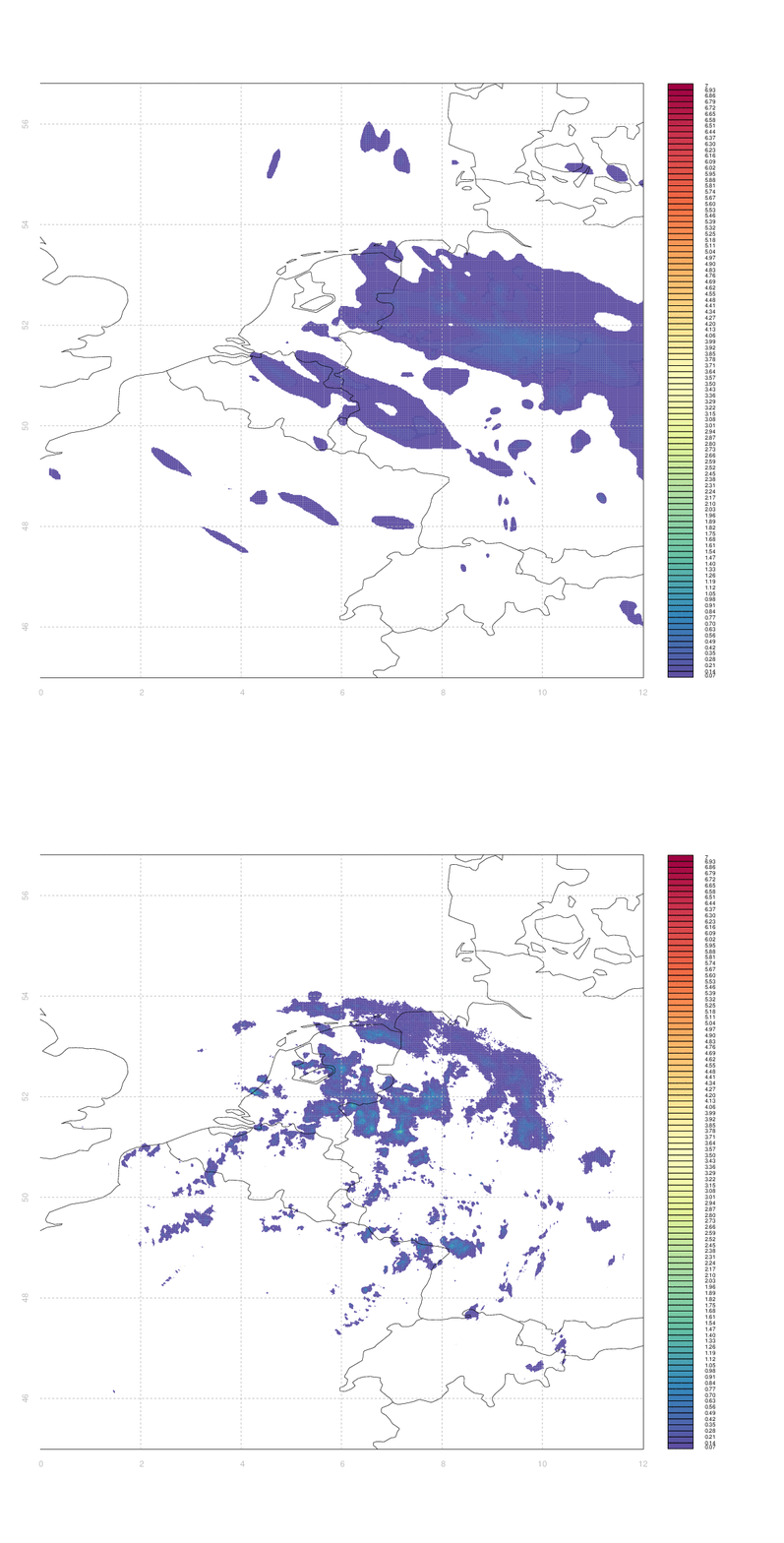
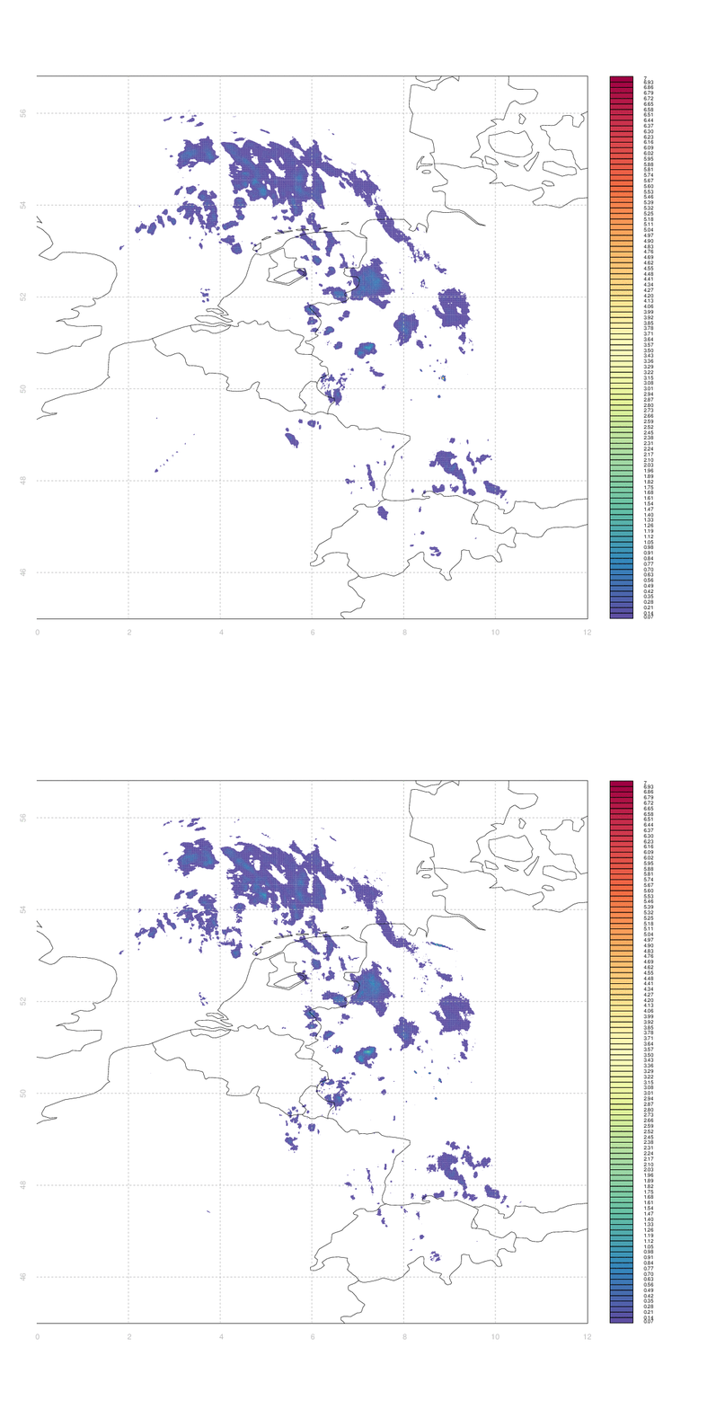
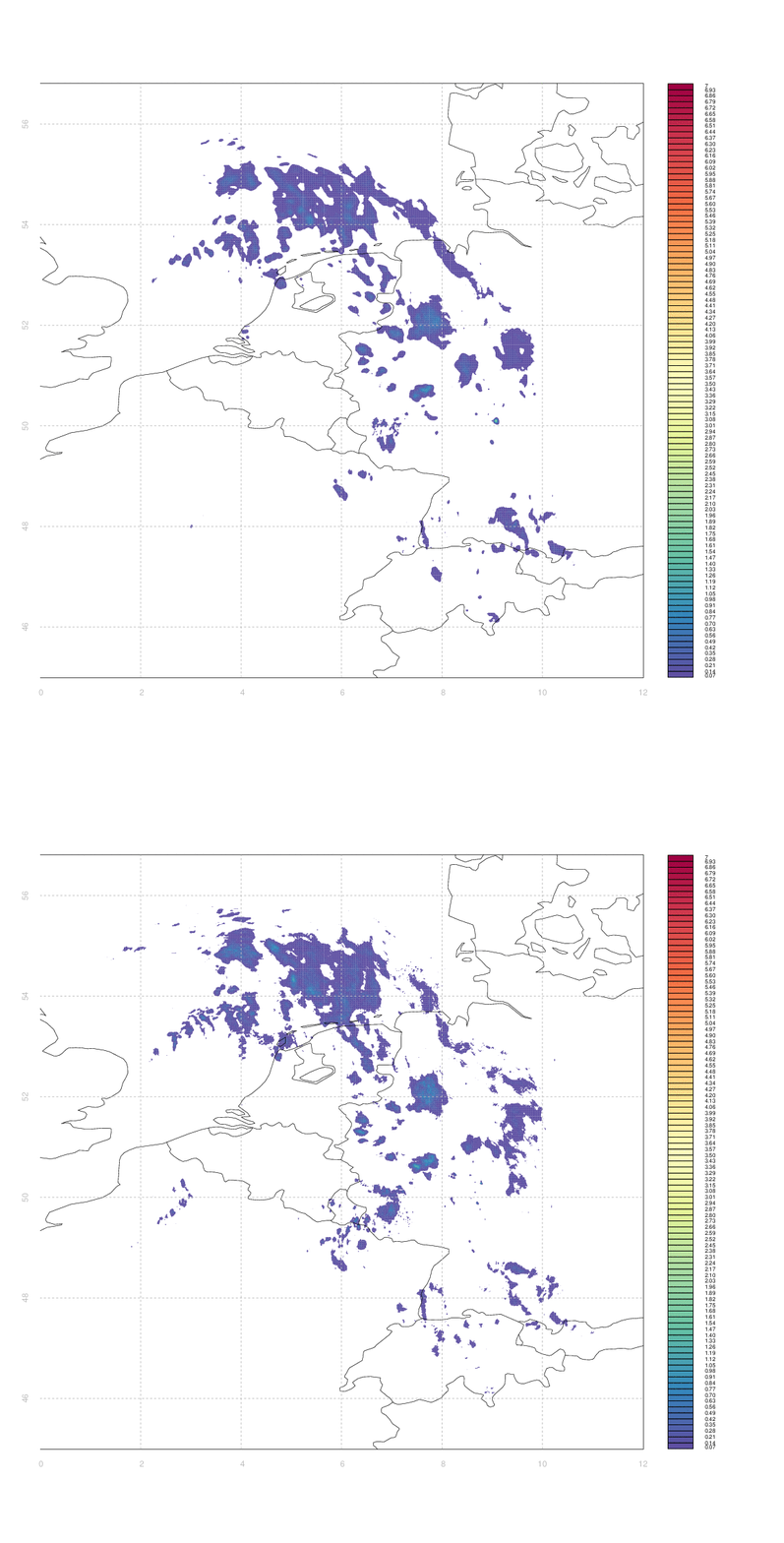
I have a number of arrays describing both forecasts and observations of geospatial data (e.g. precipitation intensity, cloud fields...). Included are four animated gifs, each looping back and forth between an observation (of precipitation) & a forecast covering the period of the observation. The four forecasts vary markedly in quality (from extremely good in the first case to terrible in the fourth).

I would like to have some way of systematically quantifying the similarity between two such arrays (e.g. between an observation and its associated forecast). I don't really know any more sophisticated way than to simply take the difference between two arrays (normalized somehow, e.g. by dividing by the mean of one of the first).

The problem is that 'scoring' the forecasts in this way gives case #3 & #4 equally bad marks - even though from visual inspection case #3 appears substantially better than #4. Clouds which are in slightly the wrong place (e.g. the ones in central Germany, or in Switzerland & Western Austria, in case #3) score equally poorly to those which are in entirely the wrong place, or simply absent.

Ideally, I'd like some measure of the minimum amount by which one image needs to be 'deformed' to yield another one, but I have no idea how to approach that in anything like a systematic manner.
An animated gif comparing observed precipitation to a forecast covering the same period n animated gif comparing observed precipitation to a forecast covering the same period n animated gif comparing observed precipitation to a forecast covering the same period n animated gif comparing observed precipitation to a forecast covering the same period

$\endgroup$

2 Answers 2

2
$\begingroup$

Model data seta can vary in several ways from a reference data set. Taylor diagrams visually compare multiple datasets output to a reference dataset (e.g., model experiments to observations). This is done by exploiting the geometric relationship between centered RMS, correlation, and standard deviation when computing differences between datasets. Several software packages exist to produce Taylor diagrams.

wiki: https://en.wikipedia.org/wiki/Taylor_diagram

publication: https://agupubs.onlinelibrary.wiley.com/doi/abs/10.1029/2000JD900719

python, e.g.: https://pypi.org/project/SkillMetrics/

$\endgroup$
0
$\begingroup$

You are looking to do some sort of regression analysis on two-dimensional data. The $r^2$ coefficient of determination value is often used for one dimensional data. $r^2=1$ means a perfect match and $r^2=0$ means no correlation. $r^2$ may be used for two-dimensional data as well; I don't know. Another example is the Kolmogorov–Smirnov test.

Neither of these are, unfortunately, something I know much about but hopefully this will point you in the right direction. What I do know is that this sort of analysis is regularly used for just this situation to assess model output.

I found a 1988 scientific paper by William H. Press and Saul A. Teukolsky entitled Kolmogorov-Smirnov Test For Two-Dimensional Data: How to tell whether a set of (x,y) data points are consistent with a particular probability distribution, or with another data set

The paper gives a Numerical Method, basically an algorithm, to apply this to your data. It's not in a modern programming language but you should be able to write the equivalent based on what is described. The R programming language may even come with an inbuilt solution.

The answer in that paper should do what you want but whether it is the best way of doing it, I have no idea.

$\endgroup$

Your Answer

By clicking “Post Your Answer”, you agree to our terms of service and acknowledge that you have read and understand our privacy policy and code of conduct.

Not the answer you're looking for? Browse other questions tagged or ask your own question.