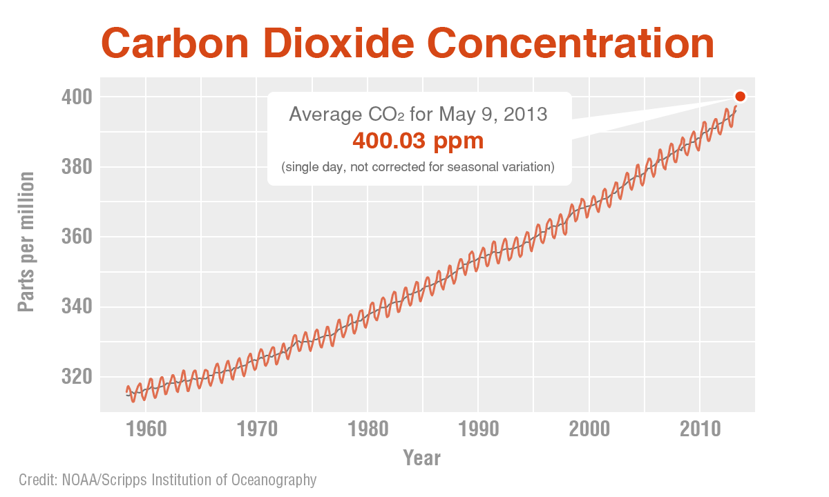
This is a graph from a reputable source of CO2 concentrations in atmosphere the last decades:
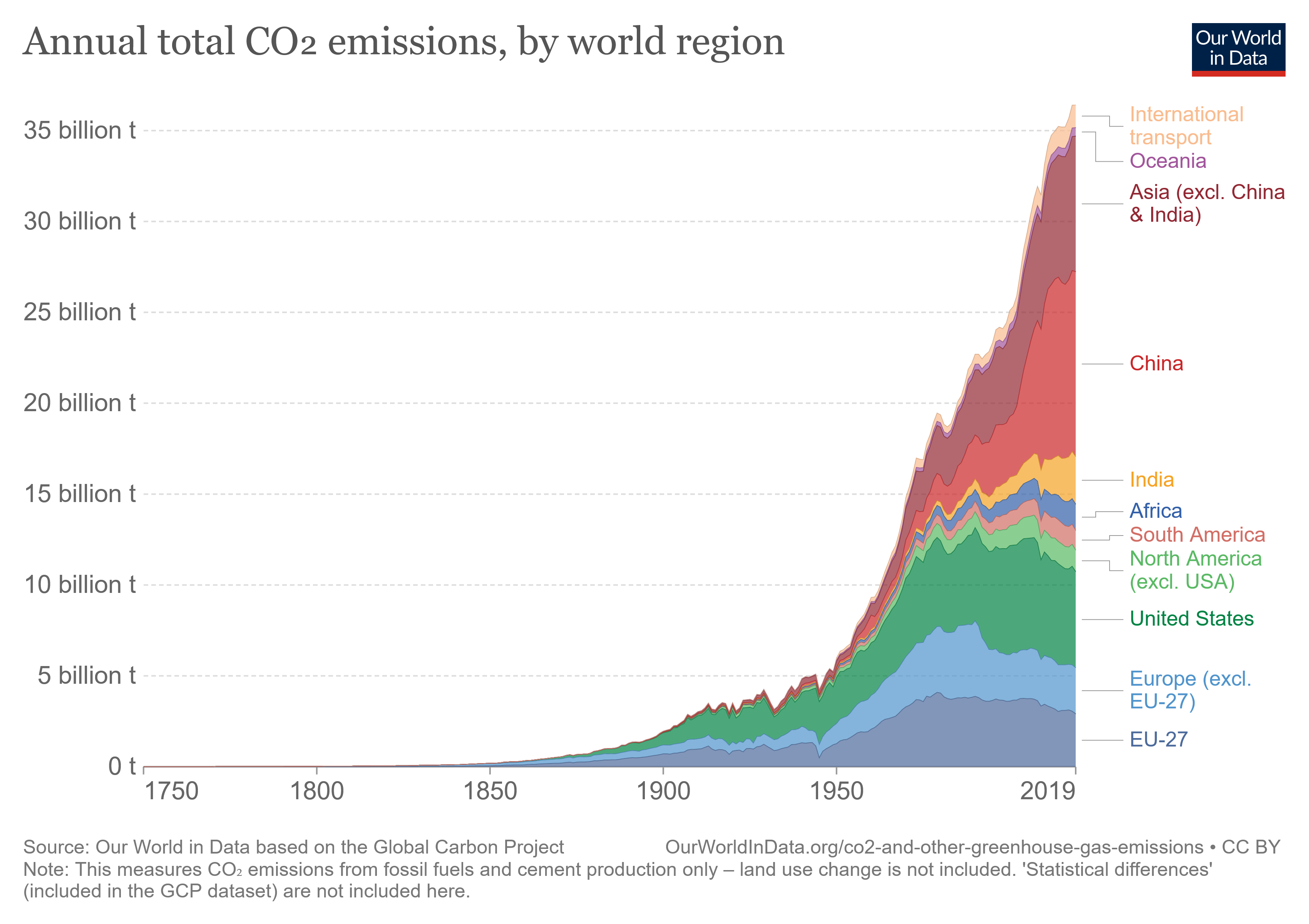
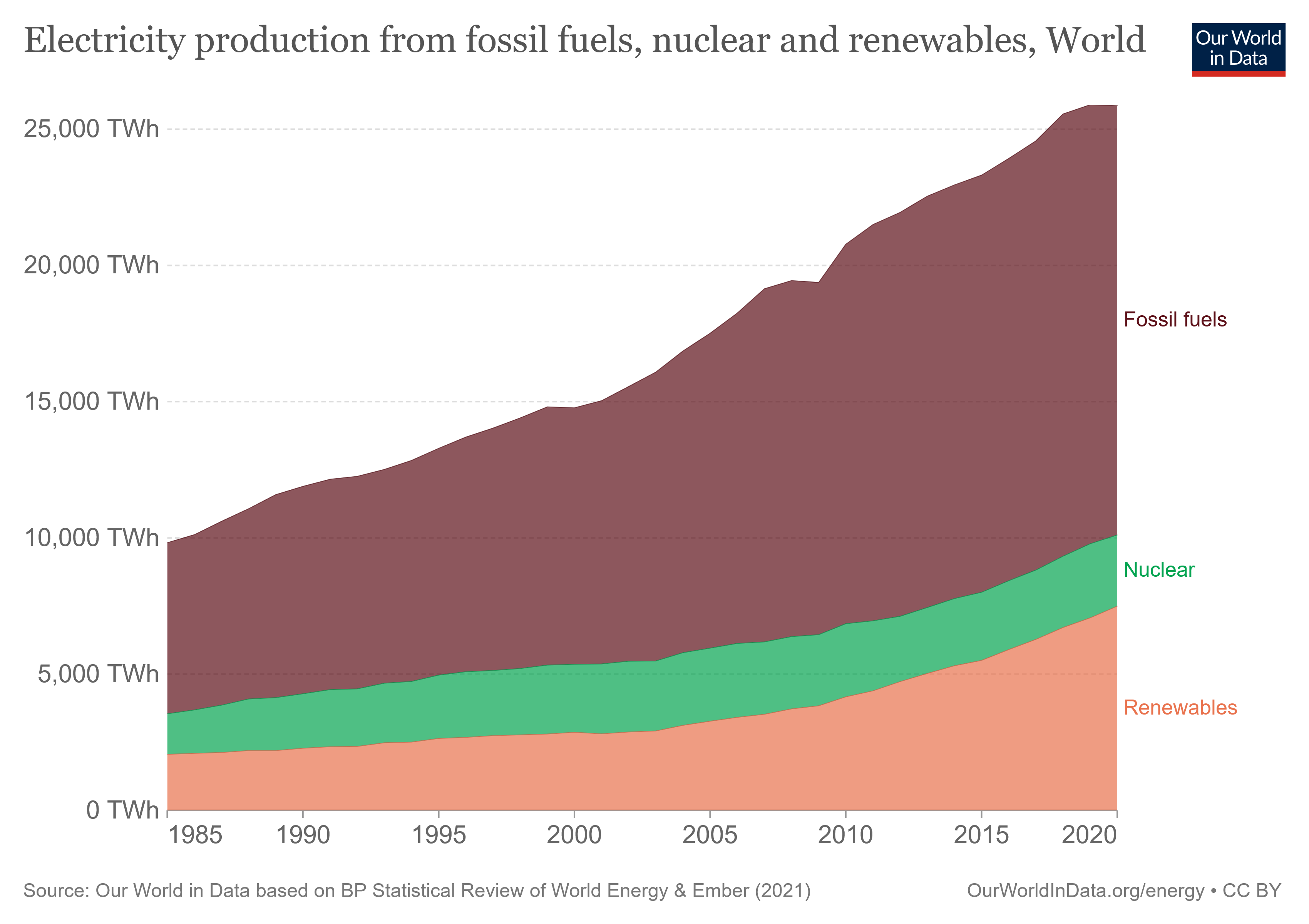
I would expect that, as we have been using clean energy for some years now, the graph would start to trend to the horizontal asymptote we all wish to see soon.
Why is the start of the energetic transition not reflected in the graph?


