41
$\begingroup$

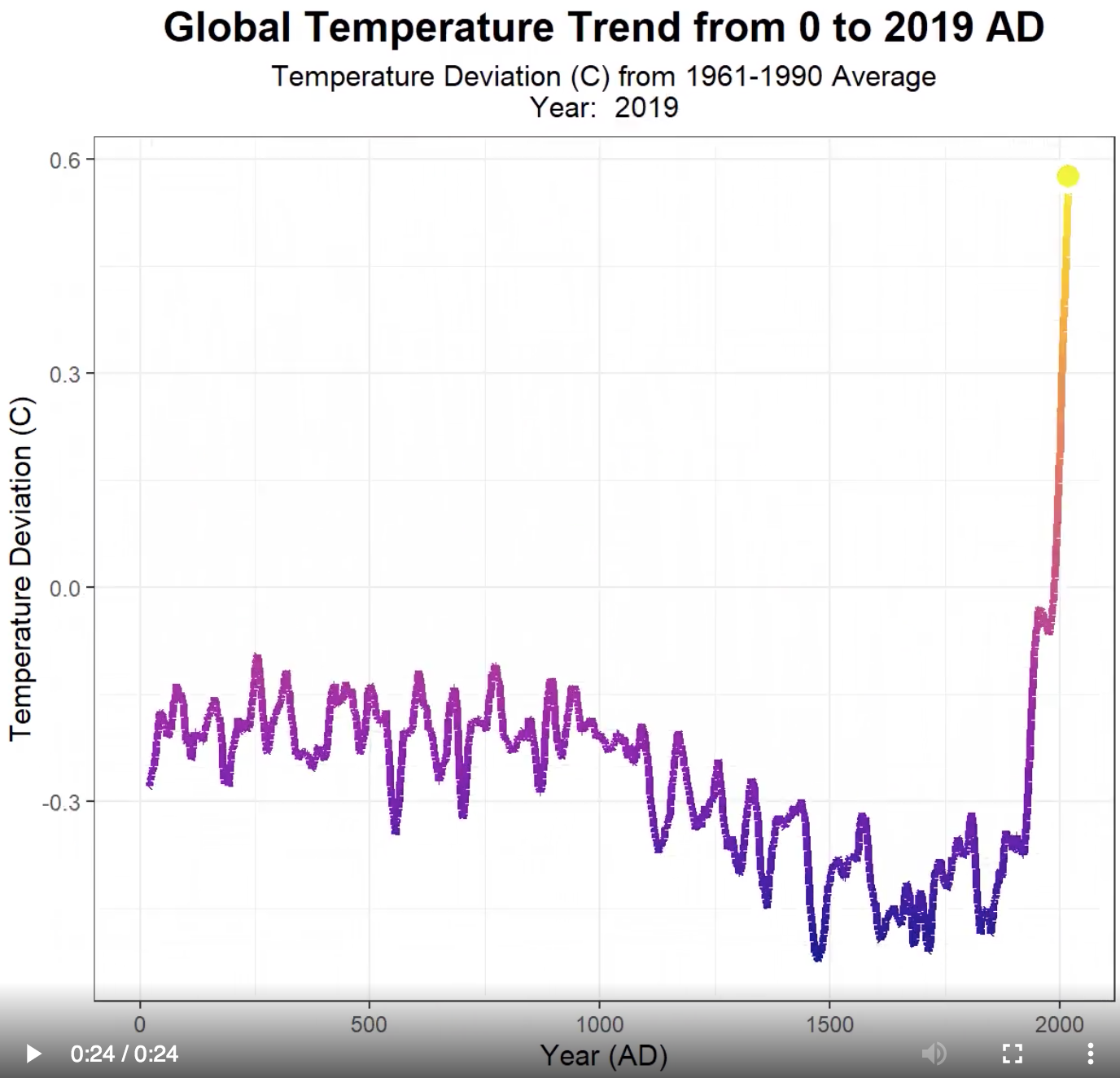
I saw this graph about the global temperature, it goes back for 2000 years.

How is it possible to measure temperature 2000 years back with such a precision of like ~0.1 C?

The image from Reddit post I don't know the source of original data.

What tools are used to measure it?


enter image description here

$\endgroup$
10
  • 1
    $\begingroup$ There are several ways, for example en.wikipedia.org/wiki/Paleoclimatology#Proxies_for_climate. In order not to guess and tailor the answer to the case, what's the source of your graph ? $\endgroup$
    – user20217
    Commented Aug 23, 2020 at 13:21
  • $\begingroup$ @a_donda Thanks, I added the link to the post on Reddit where the image is from, but I don't know what's the source of the original data. $\endgroup$
    – Alex Craft
    Commented Aug 23, 2020 at 13:24
  • 4
    $\begingroup$ Does this answer your question? How accurate are climate proxies in giving us a clear picture of global average temperatures throughout Earth history? $\endgroup$ Commented Aug 23, 2020 at 14:31
  • 2
    $\begingroup$ Precision is not the same as accuracy. I can guess that you spent $75.01 on coffee this year. That's a very precise amount, but that does not mean it is accurate. You've pointed out the precision of that graph, but you have not pointed out (nor does the graph itself state) that is it provably accurate. $\endgroup$
    – Flater
    Commented Aug 24, 2020 at 15:37
  • 1
    $\begingroup$ What does the vertical axes label mean? Deviation from what ? Its consistently negative until sometime in the last century. $\endgroup$
    – Criggie
    Commented Aug 26, 2020 at 1:57

2 Answers 2

55
$\begingroup$

How it's possible to measure temperature 2000 years ago?

Sans the technology used by Bill and Ted ("Bill and Ted's Excellent Adventure"), it obviously is not possible to directly measure the temperature from yesterday, let alone 2000 years ago, or longer. What is used are "proxies", things that can be measured today that serve as stand-ins for things such as temperature in the past.

One example of a proxy is the amount of oxygen-18 in the ice in Greenland and Antarctica. Water with two hydrogen atoms and one oxygen-16 atom has a boiling point of about 100° C. Water with the oxygen-16 atom replaced by an oxygen-18 atom has a slightly higher boiling point. This means that heavy oxygen water evaporates less readily but precipitates more readily than does normal water.

This in turn means that the fraction of oxygen 18 versus oxygen 16 in the water and air bubbles in the ancient ice in Greenland and Antarctica are indicative of the climate at the time that that ice and those air bubbles formed. Despite being a half a world apart, the ratios of oxygen-18 to oxygen-16 over time are highly consistent between Greenland and Antarctica. The consistency of these measures at half a world apart are almost universally taken as being a proxy for something else, and that something else is climate.

There are many other proxies for past climate. There are other isotopes that serve as proxies. The amounts and kinds of pollen in mountain glaciers and ice sheets form yet another kind of proxy. The kinds of plants that do grow in some locales and how fast they do grow is highly temperature dependent. Like ice, buried muds in the oceans also show variations in various proxies. Climate scientists put these proxy measurements together to arrive at the temperatures from 2000 years ago, and even further into the past.
$\endgroup$
8
  • $\begingroup$ Thanks, can you please add a note about the precision? The graph I refer to produces temperature with like 0.1C details? Is such a high precision possible for get via proxy-measures? $\endgroup$
    – Alex Craft
    Commented Aug 23, 2020 at 20:25
  • 6
    $\begingroup$ @AlexCraft The graph is showing deviation, not absolute temperature. Statistical measurements like that can be produced to arbitrary accuracy provided you end up with the same number of significant digits as the original data set, and 0.1 is well within the likely number of significant digits for those original proxy measurements. $\endgroup$ Commented Aug 23, 2020 at 23:01
  • 4
    $\begingroup$ @Alex Craft: It should be possible to find graphs with error bars. I'm sure I've seen them, but don't remember where. $\endgroup$
    – jamesqf
    Commented Aug 24, 2020 at 3:04
  • 1
    $\begingroup$ @AlexCraft Uncertainty propagation is a rather advanced mathematical topic. If the precision of the input data is known then the precision of the result can be calculated using the same model that produced the result from the input data. $\endgroup$
    – J...
    Commented Aug 24, 2020 at 11:45
  • 6
    $\begingroup$ This is a good answer, but it could be improved by adding sources. And as a pedantic note, any temperature measurement is technically a proxy, just the paleoclimatological measurement is more steps away from the measurand than your electronic or analogue thermometre (although a global average temperature estimate still needs significant processing). $\endgroup$
    – gerrit
    Commented Aug 24, 2020 at 12:21
3
$\begingroup$

Your graphic shows temperature anomalies. That is, an average temperature is calculated over a large time frame, say 15 ° C. Then each value on the graphic is the CHANGE from that average. Anomalies are nice because "inaccurate" measurement instruments (proxies) can be used. An absolute reading can be off but the reading to reading change will be much more accurate, and other inaccurate instruments can be combined. Regarding precision and uncertainty. What your graphic is showing is an expected value, which can be as "precise" as you want it to be. It is only an expected value. Consider a pair of dice. The expected value is 7, but the roll of the dice can be anywhere from 2 to 12. Of more importance is uncertainty. This is not shown in your graphic. We "expect" a certain value but we are unsure as to exactly what we will measure each time. And now we get into probabilities and distributions. Another key to low uncertainty data is a lot of measurements or a lot of proxies. Some examples of graphics with associated uncertainties are Marcott 2013, Loehle 2008, and Kaufman 2020. I believe Marcott uses 75 or so proxies. Of course present global temperature data use thousands of measurements, which drives down the uncertainty.

$\endgroup$

Your Answer

By clicking “Post Your Answer”, you agree to our terms of service and acknowledge you have read our privacy policy.

Not the answer you're looking for? Browse other questions tagged or ask your own question.