4
$\begingroup$

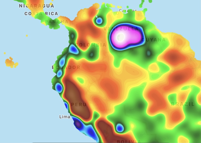
I was looking through the Weatherbug atmospheric pressure map around 8:30 am ET on Oct 26 2021, and noticed this chain of small high pressure blobs along the west coast of South America. It was also present around a few days prior, around 8 am ET on Oct 23 2021.

A screenshot of an atmospheric pressure map of South America. There is a chain of eight small elliptical high pressure blobs along the west coast, roughly from Medellín in Colombia to La Paz in Bolivia.

I looked up the geography and major winds in the region and noticed

  1. This is a region with mountains nearly along the coast
  2. There are northbound trade winds that roughly hug the coast

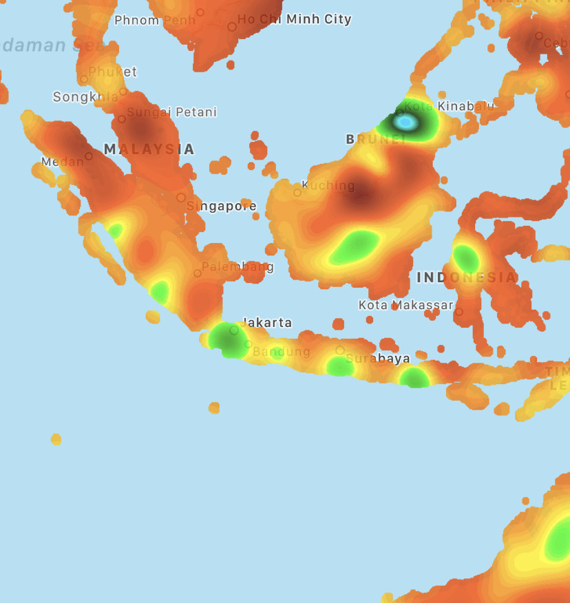
I then looked for a similar effect in other places with similar conditions and found this other high pressure chain along the southwest edge of Indonesia (screenshot from around 12 pm ET on Oct 26 2021):

Six small blobs of high pressure extend across the southwest side of Indonesia, roughly from Padang in West Sumatra to Bali. This high pressure chain, compared to the South American one, has a lower maximum pressure, and more extensive low pressure regions between the blobs.

There's a coast-hugging wind along this region (this one eastbound), and as far as I can tell the mountains here are lower than the ones in South America. I've noticed the high pressure blobs seem smaller and have a lower maximum pressure, though this may be due to it being night there when I checked.

With all that background information, my questions are: what, physically, causes this effect? Are these high-pressure chains semi-permanent, and if so, do the individual blobs tend to stay in the same place or shift around a bit?

My background's in physics rather than meteorology so I'd love an answer that describes the physical phenomena or "follows the wind" as it encounters mountains and valleys. Bonus points for descriptions of how e.g. mountain spacing, mountain height, wind speed, etc may affect blob spacing and pressure magnitude.
$\endgroup$
0

1 Answer 1

3
$\begingroup$

It's really not clear from their website what data source those maps are showing. They could be derived purely from surface observations, purely from model output, some atmospheric analysis combination of the two, or something else.

When I see such neat bullseyes like that, it's normally a warning sign that someone is trying to do too much with a sparse dataset by interpolating low numbers of data points over large distances. I looked into quite a few of the blobs on your maps and they were all located in remote, sparsely populated regions such as mountains, national parks or extensive forests, often with an airfield or research station nearby where there could be an isolated weather station. There are similar oddities in their wind speed maps, which mainly show blobs centered on towns and cities where weather stations are likely to be located:

enter image description here

Note that over the US the wind speed map is broadly in line with the ECMWF analysis, albeit with lots of artificial blobbiness because of whatever sampling and interpolating they're doing.

I suspect that the surface pressure maps are made even worse because they're surface pressure rather than sea level pressure, so the sparse samples can reflect altitude more than transient weather. That would lead to the major features that you've highlighted being persistent in time.

The bottom line is that I think the features that you're seeing are artifacts of a bad methodology rather than a physical phenomenon.

$\endgroup$
3
  • 1
    $\begingroup$ earth.nullschool.net/#current/wind/surface/level/… Consistently the MSLP along the coast is higher than inland. $\endgroup$
    – user1066
    Commented Oct 27, 2021 at 14:01
  • 2
    $\begingroup$ @gansub Yep, I'm not disputing that, but that doesn't explain the details of the chain of stationary mesoscale features, which is what I've understood the question to be about. I'm not convinced that those are resolved features in the underlying dataset, in the same way that I'm not convinced that those neatly radial wind maxima over towns are resolved features. A lot of what the casual observer will be seeing in these maps is the effect of sampling/interpolation/downscaling decisions. $\endgroup$
    – Deditos
    Commented Oct 27, 2021 at 15:44
  • $\begingroup$ @Deditos I'll take a closer look at other data sets to evaluate this answer; this may take a little while. But I will say that there are definite anomalies in Weatherbug maps -- there's a persistent region of low humidity (20-40% lower than surrounding areas) over a rural part of Ontario containing the Cote Gold Project, an open pit gold mine; I've been unable to find data for that region in other data sets and have concluded it's due to a faulty weather station. Also, there's a remarkably low pressure blob over rural Venezuela in the first image of my post. $\endgroup$
    – Natavi
    Commented Oct 28, 2021 at 21:18

Your Answer

By clicking “Post Your Answer”, you agree to our terms of service and acknowledge you have read our privacy policy.

Not the answer you're looking for? Browse other questions tagged or ask your own question.